Męski barber shop
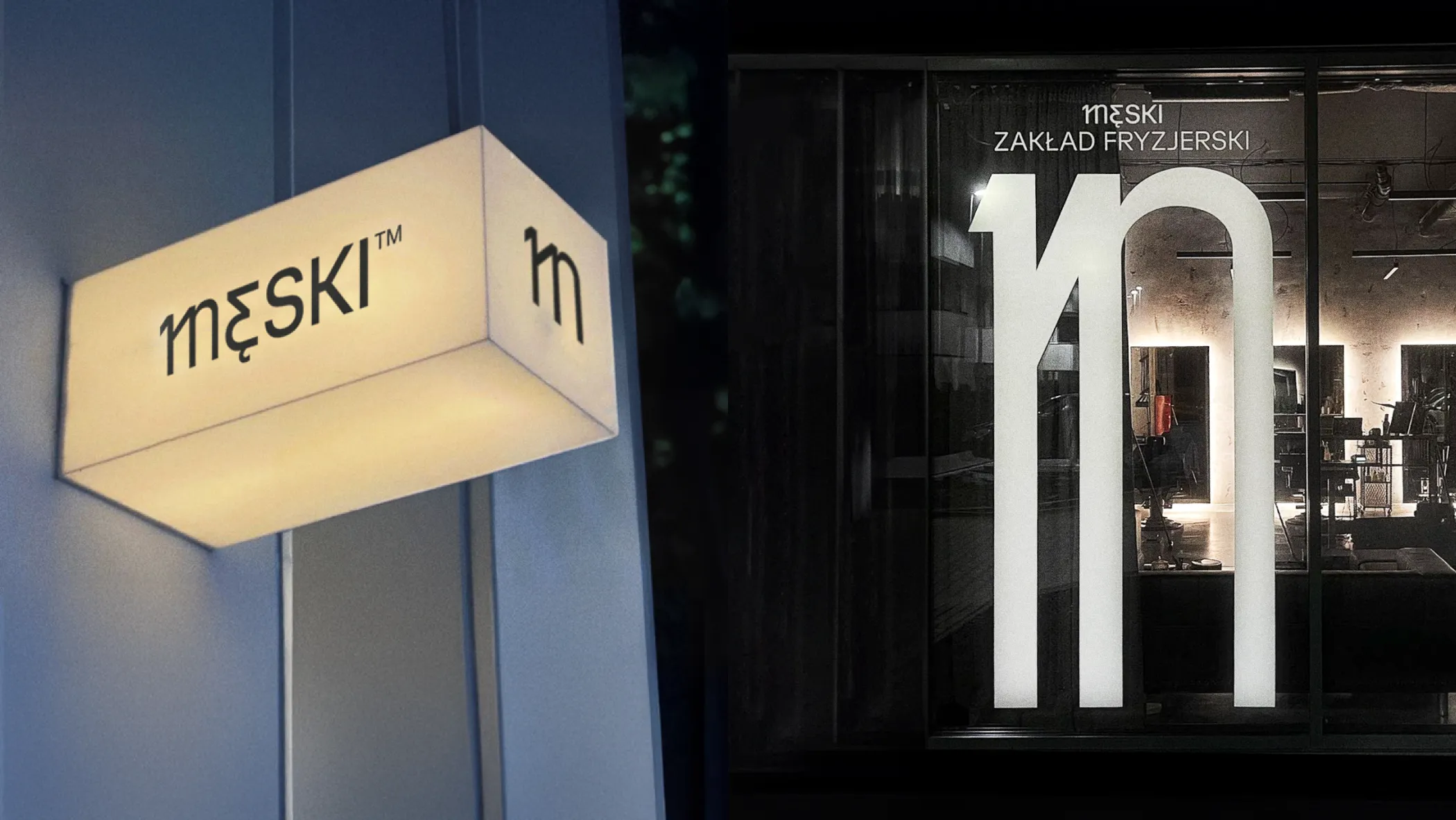
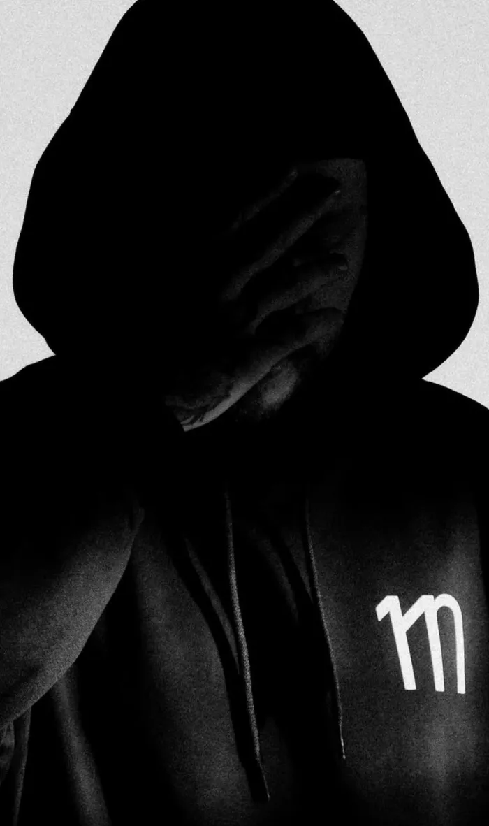
Męski is a chain of barbershops based in Łódź, Poland. The essence of the brand lies in simplicity and uncompromising authenticity. More than just a place for a haircut, it's a space designed to build a community. Here, traditional barbering techniques meet an innovative, forward-thinking approach to hairstyling.The core challenge in creating this brand identity was blending two seemingly different worlds: the raw energy of street culture, community, and inclusivity with the refined aesthetics of high-end, contemporary hairdressing. The result is a modernist visual language infused with the grit and spirit of the streets.The identity for Męski also needed to be flexible to support the brand's diverse branches of growth. Męski is not just about barbering services—it's about sharing knowledge through workshops, running a constantly expanding merchandise store, and creating a welcoming place to connect over coffee. The minimal yet versatile design of the logo ensures it can adapt seamlessly to the brand's dynamic evolution.The first letter of the logotype also serves as a responsive, scalable emblem. It can stretch from its base logotype proportions to fit different spatial contexts, always retaining its recognizability. This transformation draws direct inspiration from street tag culture, allowing the symbol to shift fluidly between elegant typography and raw, urban lettering bridging these two distinct worlds into a single, cohesive identity.
APPLYING IDENTITY
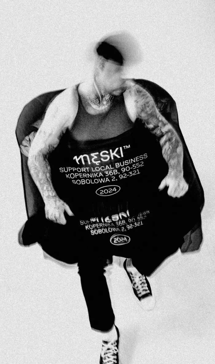
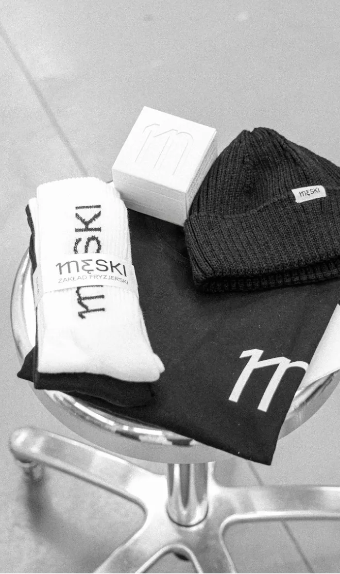
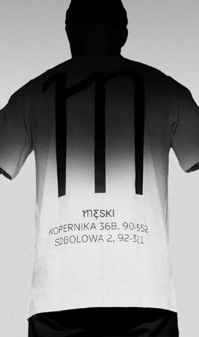
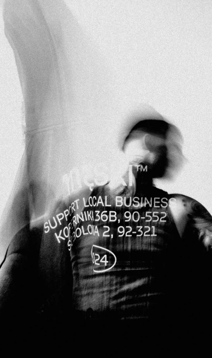
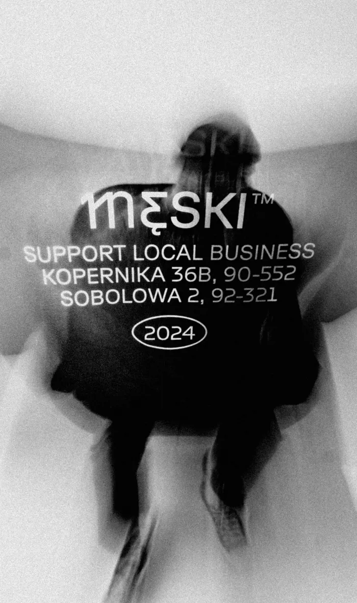
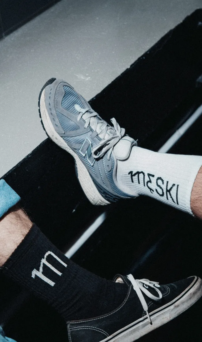
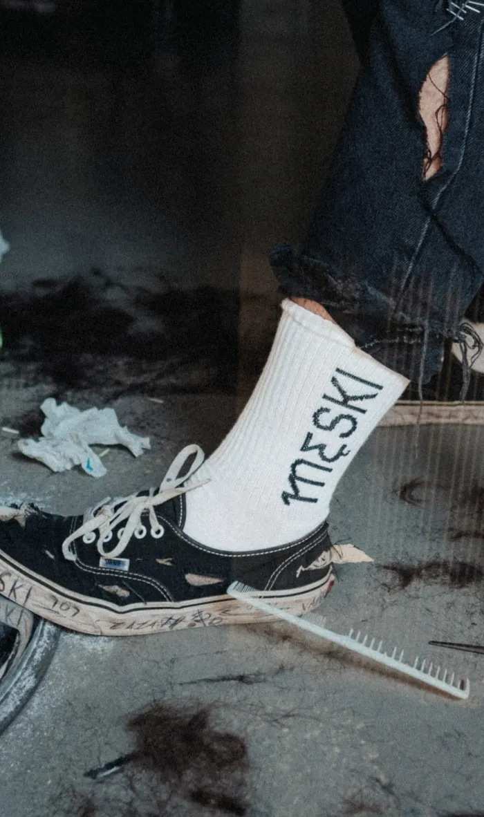
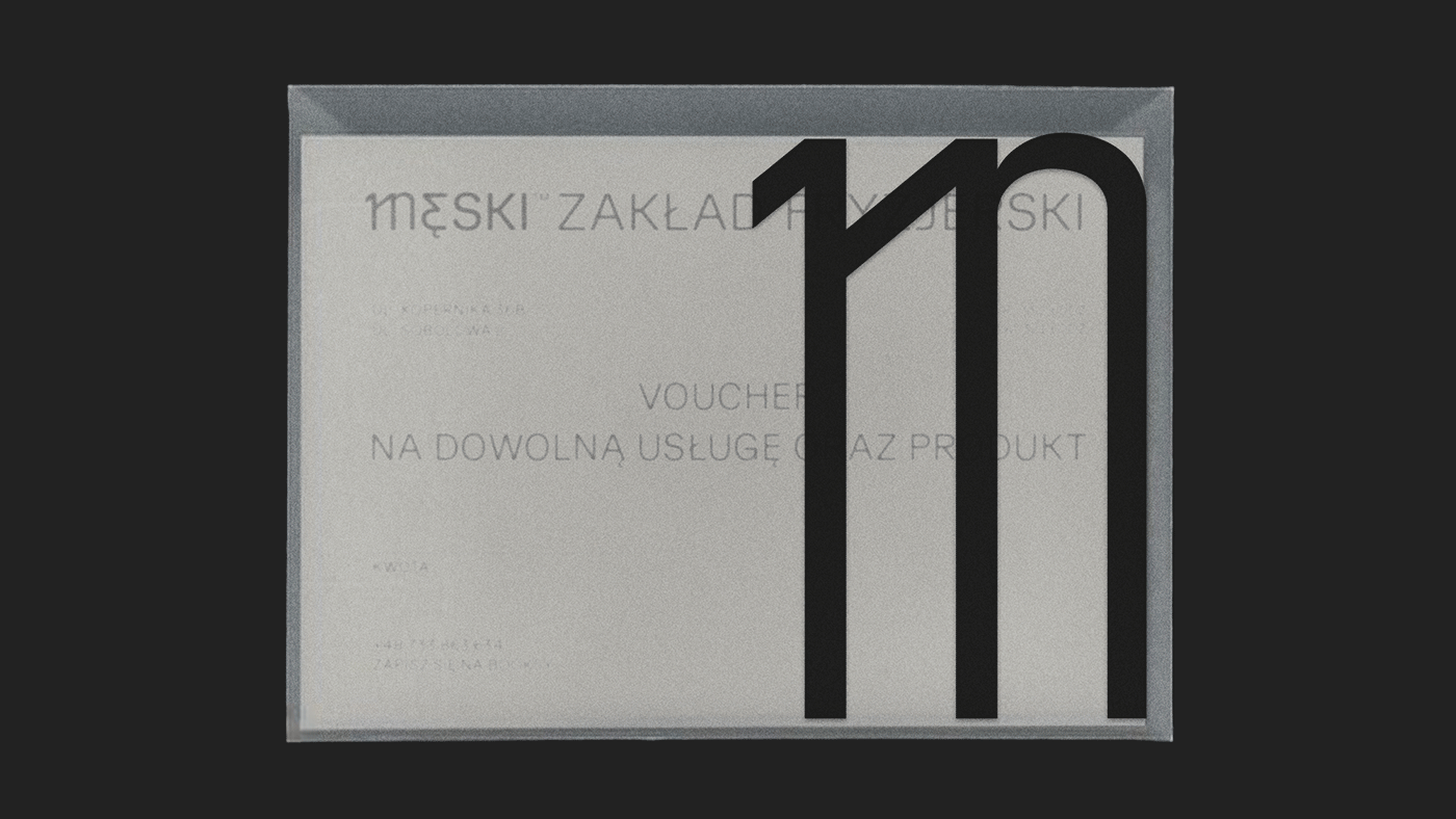
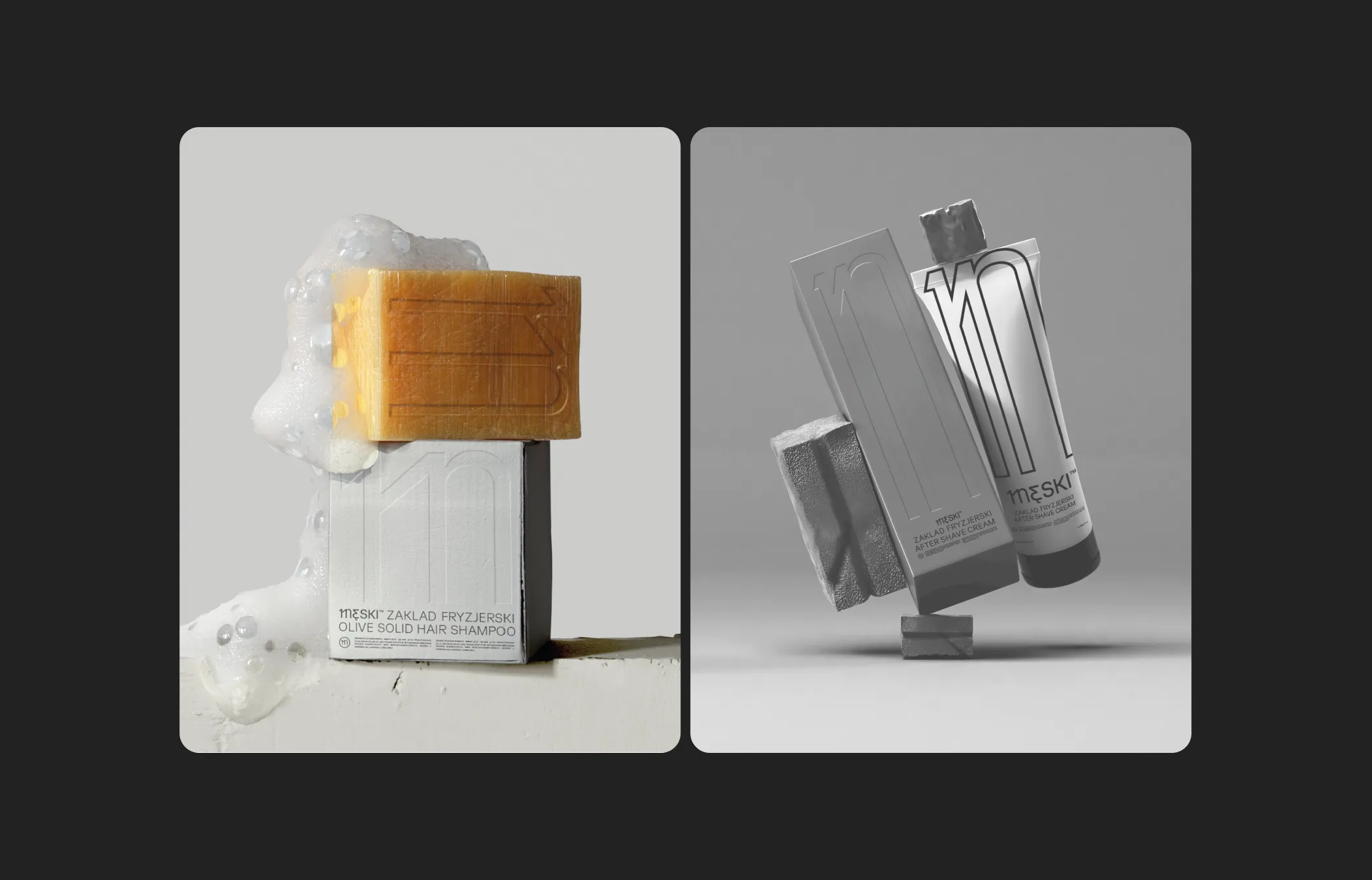
The Męski identity extends far beyond a simple logo - it lives and breathes throughout the brand's physical and digital presence. The system includes a diverse range of merchandise such as socks, hoodies, t-shirts, and caps, with plans to expand the product line in the near future.Inside the salons, custom neon signs, window graphics, and storefront signage bring the brand's urban yet minimalist vibe to life, creating an inviting atmosphere for customers. Additional touchpoints include vouchers, workshop certificates, social media visuals, and a soon-to-launch website serving both as a brand showcase and an e-commerce platform.Given the variety of formats and applications, the logo's scalable design is a key asset, allowing seamless adaptation to different contexts without losing its core essence. The brand currently operates two locations within Łódź, further emphasizing the need for a flexible identity system that can unify all touchpoints across physical spaces.Typography plays a crucial role in reinforcing the modern, clean aesthetic - the identity utilizes GT Planar by Grilli Type, known for its precision and contemporary elegance.
Art direction: Ksawery Karczewski
Graphic Design: Ksawery Karczewski and Szymon Perzanowski
Animation: Szymon Perzanowski and Ksawery Karczewski
Photography: wolnego.co and Mikołaj Nowak
Copyright: Gizmo
Thanks for watching
Follow us on instagram
@gizmo.works
Designed by: